ApexVol Market Overview Explained — Read the Entire Options Market in 60 Seconds
See how the ApexVol Market Overview page gives you a complete snapshot of the options market — volatility regime, sector heat, index levels, and key metrics — all in one view.
What You'll Learn
- Read the full options market in a single dashboard view
- Understand the current volatility regime at a glance
- Identify sector-level opportunities using the market heat map
- Track key index levels and market breadth indicators
Video Summary
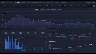
The Market Overview Dashboard
The ApexVol Market Overview page is designed to give you a complete picture of the options market in seconds. Instead of flipping between multiple tools and tabs, everything you need is consolidated into one dashboard: volatility regime, sector analysis, index options flow, and key levels.
Volatility Regime
At the top of the page, you'll see the current volatility regime — whether the market is in a low-vol, normal, or elevated state. This is calculated using VIX levels, term structure shape, and historical context. Knowing the regime instantly tells you whether to be net sellers or buyers of premium.
Sector Heat Map
The sector breakdown shows you where volatility is concentrated across the market. You can quickly spot which sectors are seeing unusual IV expansion or contraction, helping you focus your analysis on the most actionable areas.
Putting It Together
By combining the volatility regime, sector heat, and index-level data, you get a complete market read in under 60 seconds. This is the same type of morning briefing that institutional desks use to start their trading day — now available to every ApexVol user.
Related Guides
Try this with real market data
Analyze 5,500+ stocks with real-time options chains, IV analytics, and strategy P&L calculators.
7-day free trial · No charge if you cancel